
THEHOOKFACTOR #1/100 : Empty States
Keeping Users Engaged When There's Nothing
When you open an app or a website, what's the first thing you see?
Sometimes, it's a blank canvas, a void, an empty state.
It's that moment when you haven't created any tasks, uploaded any files, or made any bookings. It's the digital equivalent of an empty room, and it's an often overlooked but incredibly important part of user experience design.
What is Empty State Engagement?
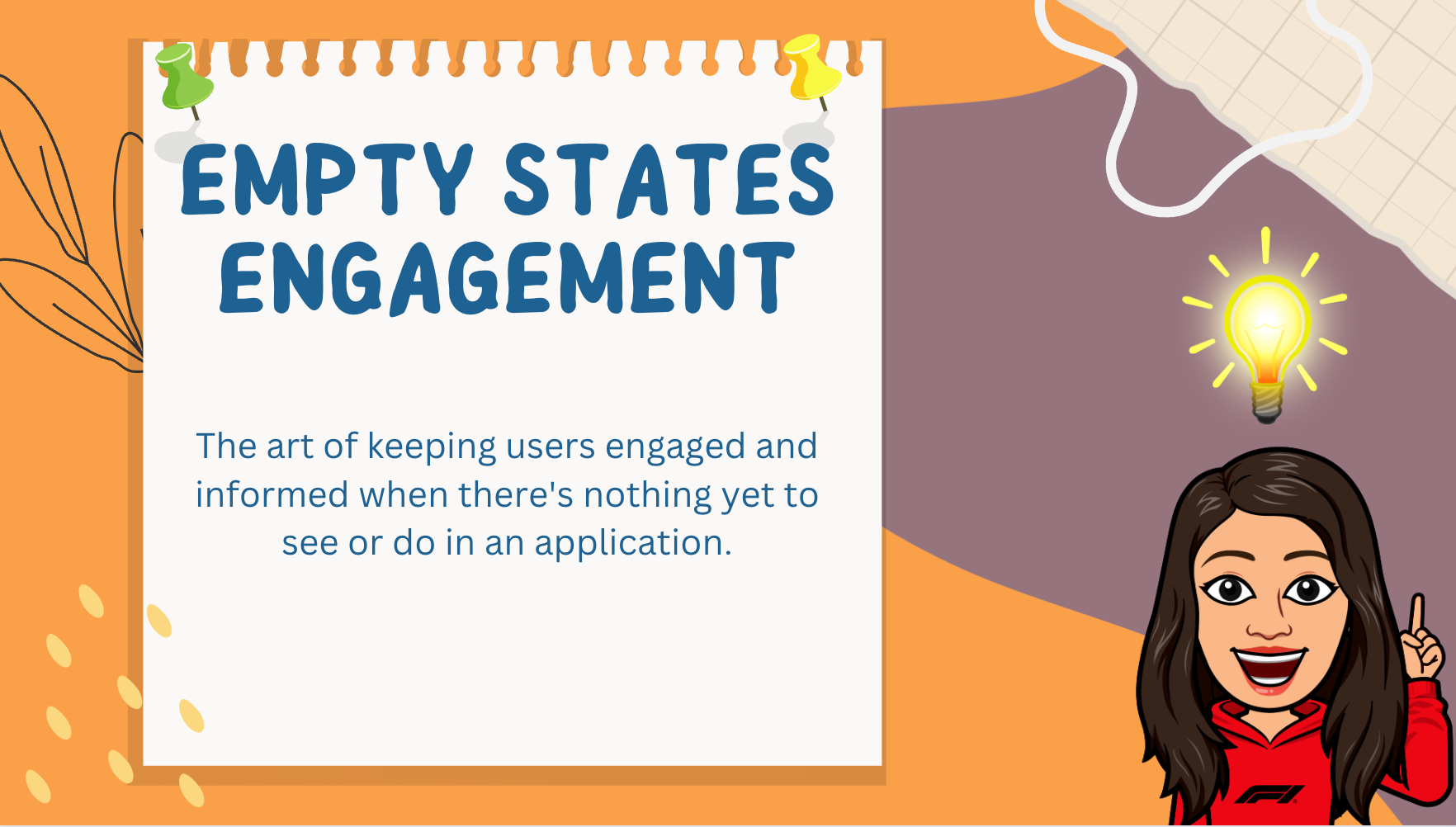
Empty State Engagement is the digital welcome mat, an opportunity to guide users, set expectations, and make a positive first impression. Think of it as the host who greets you at the door of a party, ensuring you feel welcome and comfortable, even before the festivities begin.
Why Empty State Engagement Matters?
In the fast-paced digital world, where users have plenty of choices, a lackluster empty state can be a missed opportunity. An engaging empty state can:
Reduce User Frustration: Instead of staring at a blank screen wondering what to do, users are guided and encouraged to take the first step.
Set Expectations: It can convey the app's value and what users can achieve, setting clear expectations from the start.
Encourage Action: Empty states can nudge users to create content, set up profiles, or initiate tasks, increasing user interaction.
1
B2C Example: Airbnb
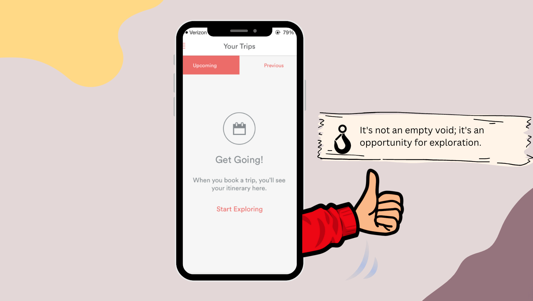
Consider Airbnb. When you haven't booked any stays, their empty state screen greets you with inviting images and personalized suggestions. It keeps you engaged, showing you the potential adventures you can embark on.
B2B Example: Asana
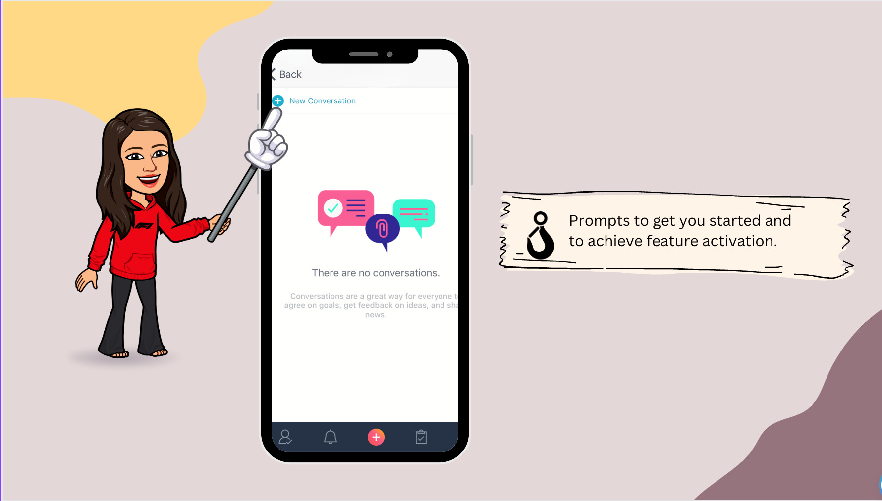
In the business world, Asana employs Empty State Engagement masterfully. When you begin using Asana, the platform offers helpful prompts and showcases the tool's features. It transforms a potentially barren workspace into a welcoming, interactive environment, helping you get started with your projects.
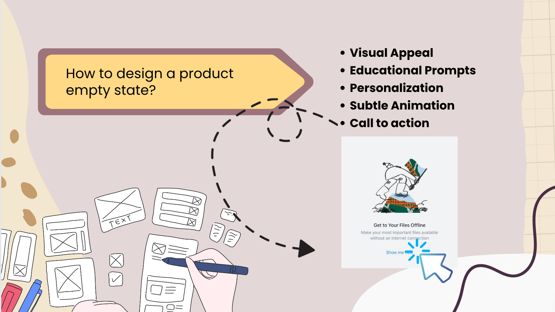
Designing Effective Empty States
Creating an engaging empty state requires thoughtful design. Here's what you can do:
Visual Appeal: Use images or illustrations that resonate with the app's purpose and the user's expectations.
Educational Prompts: Offer concise guidance on the first steps a user should take. Make it informative but not overwhelming.
Personalization: Tailor the empty state based on the user's activity and preferences to make it more relevant.
Subtle Animation: Consider using subtle animations or transitions to draw attention and make the empty state feel more dynamic.

Here's a list of diverse empty states examples within a product:
Initial Setup: A friendly welcome and guidance for users setting up an account or new feature for the first time.
Zero Results: When a search or filter yields no results, provide a reassuring message and potential next steps.
Upload or Add Content: Encourage users to populate their space by uploading files, adding products, or creating content.
Incomplete Profile: Guide users to complete their profiles by highlighting the benefits of providing more information.
No Purchases/Transactions: Display a visually appealing empty state when a user hasn't made any purchases or transactions.
No Messages or Notifications: Encourage interaction by showcasing a welcoming empty state in messaging or notification areas.
Empty Cart or Wishlist: Guide users on what to do next when their cart or wishlist is empty, perhaps with personalized recommendations.
No Subscriptions or Follows: Use a friendly empty state to prompt users to subscribe or follow, enhancing their experience.
No Saved Items or Favorites: Showcase the potential of a personalized experience by encouraging users to save items or create favorites.
No Connections or Network: In social platforms, create an engaging empty state when a user has no connections, prompting them to connect.
No Bookmarks or Saved Searches: Encourage users to bookmark content or save searches for a more tailored experience.
No Completed Tasks or Projects: Display an inspiring empty state in task or project management apps, urging users to kickstart their projects.
No Collaborators or Team Members: Showcase the collaborative potential by prompting users to invite collaborators or team members.
No Events or Appointments Scheduled: Use a visually appealing empty state in calendar apps, encouraging users to schedule events.
No Activity: Showcase an empty state when a user hasn't performed any actions yet, nudging them to start exploring.
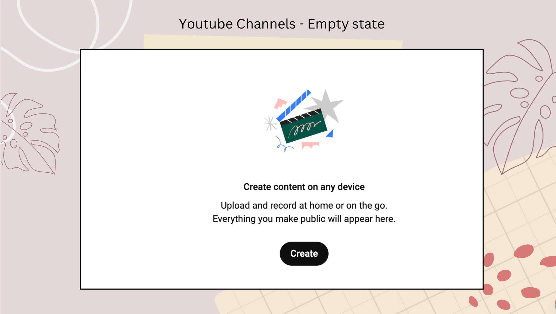
👆 These examples demonstrate the versatility of empty states in guiding users and enhancing their experience within a product.
Conclusion
Empty State Engagement is the unsung hero of user experience design. It's that warm greeting at the entrance that makes you feel like you belong even before the party begins. Whether you're booking a vacation on Airbnb or managing projects on Asana, the empty state sets the stage for a positive and engaging experience. So, the next time you see an empty state, remember it's not empty; it's an opportunity waiting to be discovered.
Sruthi singing off 👋